Case study for Brands Focus pages
Note:
- All filters are applied to all graphs of your dashboard. Please keep this in mind when doing your analysis. You have to filter by brand, channel (print, online, social), date and country.
- All graphs are clickable, when clicking you will get a view of the top 10 placements for the scope analyzed in the graph (specific date, voice type, etc).
- All graphs are available to download in excel
Main KPIs

MIV: Total MIV on the scope of your filters.
If the date you asked for is a month, it's compared to the previous month and if you select custom dates, it's compared to the same number of days preceding your date selection. Ex: If you select Sept 1st to Sept 7th, it will be compared to August 25th to August 31st.
Analysis tips : Of course here, the objective is to see this number grow.
Number of placements : Total number of placements (articles, posts) on the scope of your filters.
MIV/placements : Average MIV per placement (total MIV divided by total number of placements).
Analysis tips : This shows the "quality" of the coverage, seeing this number go down can be good news if the volume rises.
Evolution graph
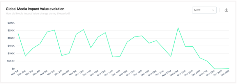
This line chart shows the evolution of MIV on the period selected in filters.
If you select 2 months or less, data is displayed day per day. If you select more than 2 months, data is displayed month per month.
Analysis tips : Here it's interesting to analyze the impact of an event/campaign on the timeline. It can also be interesting to use the on-clic to understand which placement brought a spike.
Note: The first day of the month is often very high compared to the rest of the month. This is due to the fact that most print monthly publications are attributed to the first day of the month.
Map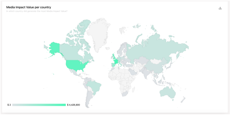
This map shows total MIV per country, the darker a country is, the bigger the total MIV.
Note:
- Each Voice can only have one country. Ex: all of Vogue US MIV will be attributed to the US even if some people may read Vogue US in other countries.
Voice Mix
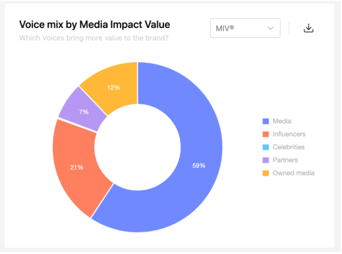
This donut chart presents an aggregation per Voice type. You can see it in MIV or placements.
Analysis tips : Celebrities often bring a bigger proportion of the MIV than the placement because they bring a lot of MIV/placement.
Note:
- If an influencer writes an article for a media it will be stored under media - we only focus on the source publishing the content.
- If a media talks about a celebrity, it will be stored under media.
- Each piece of content can have only one voice type.
Channel Mix
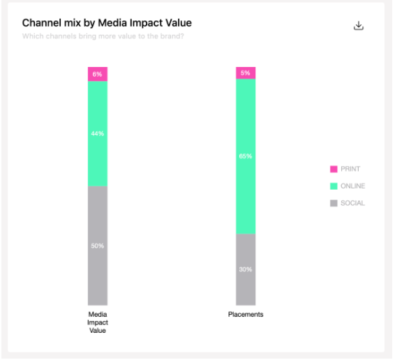
This bar chart presents an aggregation per channel type. You can see it in MIV and placements next to each other.
Channels that are available are : Print editorial, Online media, Blogs, Slideshows, Instagram, Youtube, Facebook, Twitter and TikTok.
Analysis tips : Some channels often bring more value with less placements (Youtube, Print...)
Brand association
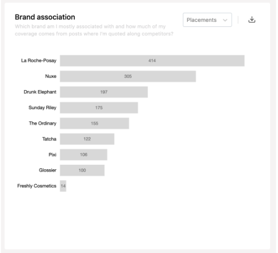
This horizontal bar chart shows "brand proximity". It is displayed first in the number of placements and then in MIV and shows the number of article/post/page where your brand is quoted along with another brand.
Analysis tips : This can help you understand how media/influencers perceive your brand and with which other brands people will read about them.
Key Voices
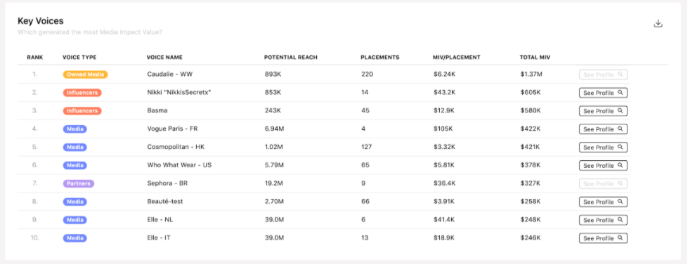
This table analyzes Voices on a cross channel basis. They are ordered by the total MIV generated.
Ex: Vogue FR gathers the print version, the online version and the social accounts of Vogue FR.
Analysis tips : This is one of our key assets as a "traditional" way of analyzing media data. Most of our competitors are unable to do this cross-channel analysis of a Voice and can only analyze by channel. However, today when a brand partners with a media it's not just in print; it's in print, online and social.
Top 10 placements
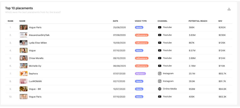
This table displays the top 10 placements in MIV. For each placement there is the date of publication, the voice type, the channel, potential reach and MIV.
Follower count evolution
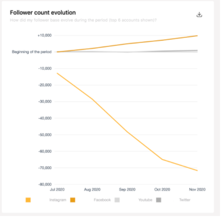
This line chart is only available only for Owned Media Voice type.
You can do the analysis of the evolution of the number of followers for each of the brand’s owned accounts. The number of followers is initialized at the beginning of the period analyzed to be able to see the evolution. When hovering you can also see the actual number of followers for the account.
For example, during the period the brand lost a little more than 70 000 Instagram followers.
Tips : Remember that if the graphs become too crowded you can hide lines by clicking on the legend.
Partners type Mix
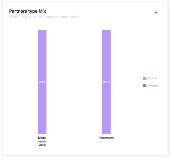
This bar chart is only available for Partners Voice type.
You can analyze how much of your partners are retailers, other brands, foundations or agencies in MIV and placements.
For example here 100% of the Partners MIV for the brand comes from other Brands.
Influencer Tiering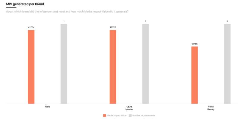
This bar chart is only available for the Influencers Voice type.
Reminder of Influencer tiers :
Micro: under 100K followers on all channels
Mid-tier: up to 100K to 500K followers in at least one channel
Macro: up to 500K to 2M followers in at least one channel
All Star: over 2M followers in at least one channel
Note :
- Be careful, here we display the number of influencers and not the number of placements. The objective is to see the size of the community and its overall impact.